

Harry Browne built a portfolio that has survived stagflation, the dot-com collapse, the 2008 financial crisis, and the inflation shock of 2022. It has done exactly what it was designed to do for nearly five decades. And yet, for most people reading this, it is probably the wrong portfolio to hold.
That is not a contradiction. It is the central tension worth understanding before copying any allocation model you found compelling during a rough market week. The Permanent Portfolio is a rare case of a strategy that is both well-designed and frequently mismatched to the person choosing it.
This post covers where the idea came from, what the numbers show, the trade-offs built into the design, who it genuinely suits, and the question worth asking instead of “how do I avoid volatility.”
The Idea and Its Origins
Browne conceived the Permanent Portfolio in the early 1980s, shaped by what he had just lived through. The 1970s were brutal for conventional investors: the S&P 500 lost roughly 64% of its value in real, inflation-adjusted terms over a 14-year stretch, bonds failed to protect capital, and inflation eroded cash.
His response was to stop trying to predict which economic regime would dominate, and instead build a portfolio that could survive all of them, by dividing economic conditions into four broad regimes:
- Prosperity: growth, stable prices. Stocks tend to perform best.
- Inflation: rising prices erode currency value. Gold tends to perform best.
- Deflation: falling prices, economic contraction. Long-term bonds tend to perform best.
- Recession / tight money: cash and short-term instruments preserve capital and provide flexibility.
The portfolio holds 25% in each asset and rebalances back to those weights roughly once a year. The assets are deliberately chosen for low or negative correlation, so that when one regime hurts one asset, another is usually benefiting.
This is not a gimmick. It is a serious response to a real problem: conventional portfolios are fragile to specific economic regimes, and most investors discover this only after it has cost them. For a deeper look at the mechanics, see Investopedia’s explainer.
What the Numbers Actually Show
Set the theory aside and look at what happened when this allocation ran over real market history. Backtests spanning 1978 to 2024 tell a consistent story.
- CAGR: roughly 8.0% – 8.5% annually for the Permanent Portfolio, versus roughly 11.9% for the S&P 500 and roughly 10.4% for a standard 60/40 portfolio, according to Dividendes.ch’s full backtest.
- Volatility: roughly 7.2% for the Permanent Portfolio versus roughly 15.2% for the S&P 500 – around half the turbulence, per the same Dividendes.ch data.
- Maximum drawdown: roughly 15% – 19% for the Permanent Portfolio versus roughly 51% for the S&P 500, according to Optimized Portfolio’s analysis.
That is the core trade-off: meaningfully lower returns in exchange for dramatically lower drawdowns and a much smoother ride.
The starkest way to see the cost is in terminal wealth. Over 1976 – 2016, according to Investopedia, a dollar invested in a 60/40 portfolio grew to about $50.50. The same dollar in the Permanent Portfolio grew to about $26.00 — both real success, but a very different retirement outcome.
Why the gap? The Permanent Portfolio outperforms the S&P 500 in roughly 91% of bear markets, but only about 17% of bull markets, per the Dividendes.ch backtest. Bull markets occur far more often, so the long-run return absorbs a steady drag from all the bull years it quietly underperforms in.
2022 is a useful recent illustration. It was the worst calendar year in the Permanent Portfolio’s history, losing about 11.6%, but still notably better than the S&P 500’s 17.8% loss, a 60/40 portfolio’s 22.5% loss, or long-term bonds’ 29.6% loss that year. The portfolio did not avoid pain; it simply distributed less of it.
I have simulated the Permanent Portfolio using the Portfolio Analyzer tool using the same ETFs as proxies for the four asset classes in the portfolio as the Dividendes.ch analysis confirming their results:
|
Asset Class |
Description |
Symbol |
|
Stocks |
State Street SPDR S&P 500 ETF |
SPY |
|
Bonds |
iShares 20+ Year Treasury Bond ETF |
TLT |
|
Gold |
SPDR Gold Shares |
GLD |
|
Cash |
State Street SPDR Blmbg1-3MthT-BillETF |
BIL |

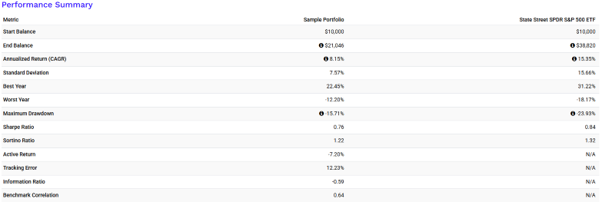
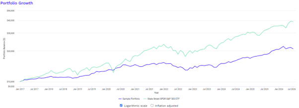
Go ahead and run some simulations yourself using the same or different assets – or any other portfolio you would like to analyze.
The Three Structural Problems
None of the following are design flaws – they are deliberate features. But a feature only helps if it suits the person using it, and for many investors these three features work against the goal they actually have: building wealth over the long run.
Twenty-five percent cash is a permanent wealth drag.
Cash earns below inflation in most environments. A structural, permanent 25% allocation means a quarter of the portfolio is, by design, not meant to grow in real terms. This is a significant, recurring opportunity cost for an investor still in the accumulation phase.
Twenty-five percent gold produces nothing.
Gold is a crisis and inflation hedge. It pays no dividend, generates no earnings, and produces no yield. Its return comes entirely from price appreciation. Across 1973 – 2022, gold was the weakest-returning of the three growth-oriented assets in the mix. A permanent quarter in a non-productive asset is defensible for capital preservation, but harder to justify for wealth accumulation.
Twenty-five percent stocks is too low for long-horizon investors.
Equities are the primary engine of long-term compounding. A 30-year-old who, adjusted for genuine risk tolerance, should reasonably hold 80 – 100% in equities gives up decades of compounding by capping equity exposure at 25%. Our earlier piece on how compounding turns time into wealth covers why the earliest, highest-equity years tend to matter most.
Taken together, these are not mistakes. They are the deliberate price of stability, built for a specific kind of investor. Most readers of this blog are not that investor.
Who It Is Actually Designed For
None of this makes the Permanent Portfolio a bad portfolio. It makes it a mismatched portfolio for most people who encounter it. Fairly assessed, it makes genuine sense in specific circumstances:
- Retirees or near-retirees in drawdown phase, who cannot absorb a 50%+ decline and have no earned income to recover with.
- Investors with extreme loss aversion. Someone who would realistically panic-sell during a 30% drawdown is often better served by a strategy that limits drawdowns to roughly 15%, even if long-run returns are lower. The behavioral benefit of staying invested is real.
- Very short time horizons, under roughly 10 years, where capital preservation outweighs accumulation.
- A partial allocation within a larger portfolio. The “sleep at night” portion alongside a more growth-oriented core, rather than the entire strategy.
The common thread is an honest assessment of risk capacity, not just risk appetite. It is worth working through what your actual risk tolerance is – separating how much risk you can afford to take from how much you feel comfortable taking. The gap between those two is where portfolio mistakes tend to live.
The Right Question to Ask
The real problem with the Permanent Portfolio is rarely the portfolio itself. It is the timing and reasoning behind why investors choose it. People tend to discover Harry Browne’s allocation after a crash – when volatility feels unbearable and a smooth, gently rising equity curve looks deeply appealing. That is precisely the wrong moment to make a structural, decades-long portfolio decision.
The right question was never “which portfolio has the smoothest ride.” It is: which portfolio gives me the best probability of reaching my financial goals, given my actual time horizon, income stability, and genuine capacity to bear risk – not just my mood after a bad quarter.
For most investors in their 30s, 40s, and even 50s, the honest answer involves substantially more equity exposure than 25%. The smoother ride is real, but so is its multi-decade cost.
Whatever allocation you land on, the discipline of sticking with it matters as much as the allocation itself. Our earlier post on why doing nothing is sometimes the wrong answer covers how portfolios drift from their targets, and why periodic rebalancing – not constant tinkering – keeps a strategy doing what it was designed to do.
Closing Reflection
Harry Browne built something that has genuinely worked for more than fifty years, through stagflation, crashes, and the 2022 inflation shock. That is a real achievement, and the portfolio deserves credit for delivering exactly what it promised: capital preservation with reduced volatility, at the cost of lower long-run growth. The issue was never whether the Permanent Portfolio is a good strategy. It is whether it is a good strategy for you.
Before you reach for the comfort of a smoother ride, ask yourself whether you are managing genuine risk or managing the anxiety of watching your portfolio fall?
Final Thoughts
- The Permanent Portfolio was built to survive every economic regime – prosperity, inflation, deflation, and recession – by holding 25% each in stocks, gold, bonds, and cash.
- It delivers on that promise: lower volatility (roughly 7.2% vs. 15.2% for the S&P 500) and far shallower drawdowns (roughly 15% – 19% vs. roughly 51%).
- That stability comes at a real cost in compounded wealth: roughly 8.0% – 8.5% CAGR versus roughly 11.9% for the S&P 500 over 1978 – 2024, a gap that becomes stark over decades.
- The 25% cash and 25% gold allocations are structural drags on long-run growth; the 25% equity allocation is too low for most long-horizon investors.
- It is best suited to retirees, extremely loss-averse investors, short time horizons, or as a partial “sleep at night” sleeve within a larger portfolio but not as a default strategy for accumulation-phase investors.
- The right starting point is not which portfolio feels smoothest, but an honest read of your own time horizon and risk capacity.